
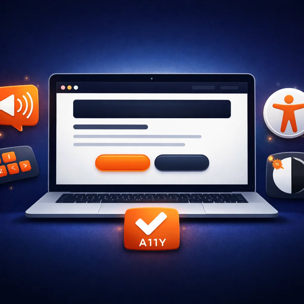
Web accessibility (a11y) helps blind, visually impaired and older users, but it also improves SEO, UX and business results. In this article you’ll see which mistakes to avoid and how to prepare your website for the new standards.
What is accessibility (a11y) and why it matters
When we talk about web accessibility (a11y), we don’t just mean “bigger font”.
An accessible website is one that can be used by:
- people with visual impairments (blind and partially sighted)
- older users
- people who use a keyboard instead of a mouse
- users with cognitive difficulties
- anyone reading your content on a phone in poor conditions (sunlight, small screen, distractions…)
In other words – accessibility is not only “social responsibility”, it is a very real business interest.
A website that everyone can use:
- has a larger reach (more potential clients)
- sends a quality signal to Google and AI assistants
- reduces the risk of complaints and legal issues
Who benefits from an accessible website
1. Users with visual impairments
Blind and partially sighted users rely on screen readers such as:
- NVDA, JAWS (Windows)
- VoiceOver (macOS, iOS)
- TalkBack (Android)
If a page doesn’t have a logical heading structure, alt text for images and correctly labeled buttons, the screen reader “sees” only chaos.
The result: the user leaves your website in a few seconds.
2. Older users and people on mobile
Even people without any official diagnosis related to vision struggle with:
- tiny text
- poor contrast
- tap targets that are too small
On top of that, most visits today come from mobile devices – where all of these problems are even more visible.
3. Your SEO and AI visibility
An accessible website is usually:
- better structured (H1–H2 headings, lists, clear links)
- semantically correct (proper HTML elements)
- faster and easier to crawl
This helps:
- classic SEO (Google search results)
- the new AI search (ChatGPT, SGE, Perplexity…), because models can more easily understand what is on the page
The most common mistakes we see on websites
1. Text “locked” inside banners and images
Instead of real text, key headlines and slogans are placed inside PNG/JPG/WebP banners.
- The screen reader only sees “image.jpg”.
- Google can’t easily read your message.
- On mobile, the banner often becomes tiny and unreadable.
Better solution:
Keep the headline as normal HTML text and handle the visual styling with CSS, not with an image.
2. Navigation that doesn’t work with a keyboard
Typical issues:
- the burger menu cannot be opened with Enter/Space
- focus “falls into” the menu and cannot escape (the user gets stuck)
- dropdown menus that only open on mouse hover
If a user can’t move using the TAB key, your website practically doesn’t exist for them.
3. Low contrast and tiny fonts
Popular mistakes:
- light gray text on a light background (for example #9CA3AF on #F3F4F6)
- overly thin font weight
- text below 14–16px on desktop, even smaller on mobile
The result is eye strain and a higher bounce rate.
4. Poor alt text and headings
Alt text for images is often:
- empty
- generic (“image”, “banner”)
- or stuffed with keywords
Alt text should answer the question:
“What should the user know that they can’t see?”
How to get started with accessibility – a practical mini checklist
You don’t have to fix everything today. Start with the most important elements on your key pages (home, services, contact, top‑performing blog posts).
1. Check your heading structure
- Each page has one H1 (main heading).
- Sections use H2, subsections H3.
- Headings are not just “styled text”, but real heading elements.
This helps both people and screen readers “scan” the content and quickly find what they need.
2. Test your site using only the keyboard
Without a mouse, only:
- TAB (forward)
- SHIFT + TAB (back)
- ENTER / SPACE (activate link/button)
- ESC (close modal/menu)
Ask yourself:
- Can you clearly see where the focus is (outline around the element)?
- Can you open/close the menu and complete a form using only the keyboard?
- Do you get “stuck” anywhere?
If you can’t complete the basic flows without a mouse, users with visual impairments have an even bigger problem.
3. Check color contrast
Use free tools (for example, WebAIM Contrast Checker) and verify:
- text against background
- buttons and links against background
Aim for at least WCAG AA contrast level – that is the minimum for decent UX today.
4. Add and fix alt text
- For decorative images (ornamental lines, patterns) the alt attribute can stay empty.
- For illustrations that carry meaning, write a short, clear description.
Example of poor alt text:
“image1”
Example of better alt text:
“Laptop screen showing an accessible website with a large ‘Send inquiry’ button”
5. Test with a screen reader
You don’t have to become an expert overnight. It’s enough to:
- turn on VoiceOver (Mac / iPhone) or NVDA (Windows)
- visit your website
- try to complete the same task as a regular user (for example “send an inquiry”)
You’ll quickly see where the gaps are: elements without names, illogical order, content that gets “skipped”.
Accessibility and business results: how it pays off
It may sound like an extra cost, but accessibility has very concrete benefits:
- More conversions – clearer copy, larger buttons and a logical journey through the website help everyone, not only people with disabilities.
- Better SEO and AI visibility – structured and readable content is exactly what both Google and AI models are looking for.
- Stronger brand – you show that you think about users more seriously than your competitors.
- Easier tenders and cooperation with bigger clients – more and more companies require at least basic a11y standards from their partners’ websites.
How to move forward
If you want to approach accessibility strategically, a good plan is to:
- run a basic a11y audit on key pages
- fix critical blockers (navigation, forms, contrast)
- introduce content guidelines (how to write headings, alt text, CTAs)
- regularly check new pages and features
In this way, a11y becomes part of your everyday practice – not a one‑off “project” that everybody quickly forgets.